September 22, 2026
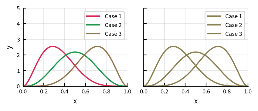
These two figures look the same to me. Like 1 in 12 men and 1 in 200 women, I’m colorblind. The right panel is a simulation of how the left panel looks to someone with deuteranopia, the most common form of colorblindness. So when someone uses colors like those on the left panel, I see the right panel and can’t interpret the figure.
Fortunately, a little understanding of how people perceive color, plus a few simple tools, lets you make figures that work for colorblind readers and are clearer for everyone.
Poor color choices cause four kinds of problems.
Colorblind readers can’t distinguish certain colors.
Even readers with normal vision don’t perceive all colors equally. A poorly designed colormap can make your data look like it has features that aren’t there.
Colors that are distinct on screen can become identical grays if someone prints or photocopies your paper in black and white.
If every figure in your talk uses a different set of colors, readers have to relearn the mapping each time.
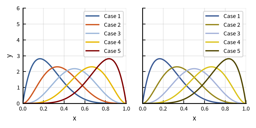
For line plots, scatter plots, and bar charts, I use the five colors below, in order. I sometimes add black or gray for reference lines or baseline cases.
| Color | Hex code | |
|---|---|---|
| Blue | #385F96 | |
| Orange | #CF5921 | |
| Light blue | #9EB8DB | |
| Gold | #E7B800 | |
| Maroon | #800000 |
The figure below shows a plot like the opening example, using these five colors. The lines stay distinguishable in the simulated-deuteranopia view on the right.
To check your own figures, upload them to the Coblis simulator. If you want a palette other than mine, try ColorBrewer. The colorblind simulations above use the model of Machado, Oliveira, and Fernandes (2009). Any simulation is approximate, since colorblindness varies from person to person, but it reliably catches problems.
A colormap uses varying colors to encode a continuous numerical value. Here the key property is perceptual uniformity: equal steps in numerical value should look like equal steps in color. The figure below shows three colormaps, and a plot of how the lightness of each one (the main cue readers use to judge value) varies along the map. Lightness is measured with CIELAB L*, where 0 is black and 100 is white.
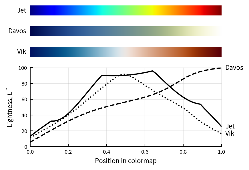
The Jet colormap was the default in MATLAB and matplotlib for many years, and it is still common, so you probably recognize it. But its lightness rises, plateaus, and falls, creating bright cyan and yellow bands that the eye reads as boundaries in the data. The problems with rainbow maps like Jet have been documented for decades (Borland and Taylor 2007, Crameri, Shephard, and Heron 2020). Matplotlib replaced Jet as its default in 2017, and its colormap documentation explains why.
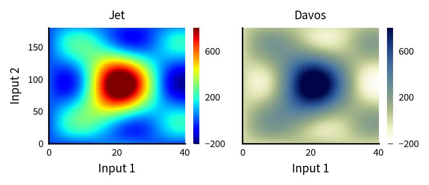
The figure below shows the same data drawn with Jet on the left, and with Davos, a perceptually uniform map, on the right. Jet suggests a ring-shaped boundary around the peak that doesn’t exist in the data. Davos shows a smooth peak, because its lightness changes steadily from one end to the other.
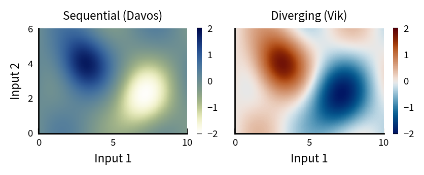
Fabio Crameri’s Davos and Vik Scientific colour maps are perceptually uniform, readable by colorblind viewers, and available for most plotting software. Python users can install them with the cmcrameri package. I use Davos for sequential data, where values run from low to high, and Vik for diverging data, where values run in two directions from a meaningful midpoint.
The figure below shows data with positive and negative values, drawn with Davos on the left and Vik on the right. With Davos, zero falls at an unremarkable middle shade, and you can’t see where the values change sign. With Vik, zero is a neutral light color and positive and negative values get different hues (with similar lightness), so the sign of every value is obvious.
Design your figures in color, but ensure they still work in grayscale, so a black-and-white printout of your paper is readable. Sequential colormaps like Davos handle this automatically, because their lightness increases steadily. For line plots, the easiest solution is to add a second visual distinction, such as line style or marker shape, alongside color. The figure below shows a line plot in color, in grayscale, and in grayscale with varied line styles.
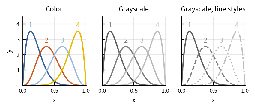
In grayscale with solid lines, curves 3 and 4 are hard to tell apart. Varied line styles fix this. The line style redundancy also helps colorblind readers, so the second encoding is helpful even if you never expect the figure to be printed. Use it sparingly, though. Solid lines in distinct colors are easier to read on screen, so I add line styles only when a figure has several series or is likely to be printed.
Make your color decisions once, write them into a style file or formatting script, and reuse them everywhere. Consistent color palettes let you combine figures from different projects in a single presentation without redrawing or making new decisions.
The figures above were all made with a Python script, bonus_colors.py, in the code repository for my book, Communication by Design. It uses the book’s matplotlib style file, which sets the palette above as the default color cycle. The script also includes short functions to simulate color vision deficiency and grayscale printing, so you can check your own palettes and colormaps.

Sign up for very occasional updates about new offerings.
